A slight Re-Design And a Blog
As any freelance Web Designer knows it’s not just enough to have a website, online portfolio, social media. These days in order to stand out and improve your Google stats, you have to have a blog too. Time for a slight re-design.
The first step in the process was to really focus on having a cup of tea and starring out of the window. Then I decided I needed to come up with a plan, everything is easier when you have a plan. Just recently I was reading various short interviews with designers and what tools they could not live without, a lot of them were the obvious ones like Photoshop or GitHub, and then one mentioned Trello. Trello is an online app for organising your workload into dynamic lists that either your team or clients can view and contribute to and allows you to see where everyone is at, at a glance. It’s very fast to learn and very fast to make up numerous to do lists that have labels and notes and sub-lists, a great way to free your mind from all the stuff you’ve tasked yourself with when doing a project.
With my workload organised I began the redesign process by roughly sketching up what I wanted the single post page to look like and what I wanted to have on it. To keep in with the front page of the site I decided it should be simple and easy to read, with an off white background the same as the About Me section on the front page and very dark blue (which matches the colour of the main menu) for the text colour. This combination gives the page less contrast and makes it less dazzling to the reader’s eyes on any monitor. At first I thought I should go with the featured image always at the top of the page but then I thought about load times. If I always had a big image at the top and then included more images on top of that it could have a detrimental effect unload times (no-one likes slow loading pages) and sometimes there just might be no need to have any images whatsoever, gasp!
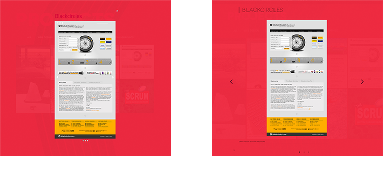
On the Home Page I decided to add a recent posts section. As an afterthought the first post, this post, is going to look a little lonesome standing there for a while until I find something else to talk about but when others are added then the grooviness will automatically kick in. On large desktop screens a previous and next button will appear and users will be able to cycle left and right through posts on a carousel, on mobile devises the carousel will automatically cycle through posts and only show 3, 2 or 1 posts depending on screen size.
I know it’s trendy to use Owl Slider but it’s infinite option is still a bit flaky so went for Slick Slider instead. Another reason for using Slick was the fact that Zurb Foundation (the framework I choose to build most sites in) no longer supports Orbit slider which I had previously used in the modal windows in the Projects section. Also in the portfolio modal windows I added a little more graphic detail to draw the eye inwards.
I knew that using Wordpress would add a bit more in terms of loading time to the site so this time around I’m minifying all my script files and using a bit of SASS to pre-compile my CSS and then spit it out all into one line. I also used “SVGO” a Nodejs based tool for optimising SVGs files (the big wavy lines in the background), you can use it as a web app or in the terminal.
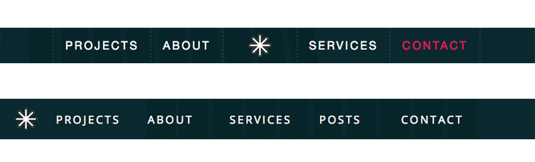
The main menu once had the little Asterisk/Star logo in the middle of the menu but due to the addition of the Posts menu item it no longer looked right in the centre and therefore I moved it over to the left where it serves as a handy way to get to the top of the page when scrolling down. I also changed it from a PNG to SVG so no matter how big or small it will always retain it’s image quality.
So looking up at this post and realising I’ve probably written to much for my first post this may bode well for future posts where I will be talking about being a Freelance Web Designer, and the work that I do including logo design and maybe even photography and animation. Stay tuned… Or even better get in touch.