
What Is the 3-Second Rule in Web Design? (And Why Your Site Is Failing It)
Published 16 January 2026 • 7 min read

The 3-second rule is simple: your website must load and communicate its value within three seconds. If your site is slow, or if a visitor can't immediately understand what you do and who it's for, they'll leave. It's not just about speed—it's about clarity.
You have roughly three seconds to prove you're worth someone's time. Some research suggests visitors form an opinion about your brand in as little as 17 milliseconds. That's faster than a blink.
According to Google's research, 40% of users will abandon a page if it takes longer than 3 seconds to load. For mobile users, that number rises to 53%. Google has since formalised these speed standards into a ranking factor called Core Web Vitals.
If you're a Leith startup or a George Street firm, you're competing in a busy market. A 40% bounce rate before the page even finishes loading isn't something most businesses can absorb.
Why Websites Fail the 3-Second Rule
If your site is slow, it's usually more than one thing. One of the biggest culprits is technical baggage. DIY builders like Wix, or bloated agency sites, are often weighed down by JavaScript bloat—code that forces browsers to work too hard before showing anything useful.
Large, unoptimised hero images can add seconds to your page load time. If your server takes two seconds just to respond, you've already failed the test before the first pixel appears.
Hosting matters too. It's better for your site to live on UK-based servers and use Content Delivery Networks (CDNs), so your data doesn't have to travel halfway around the world to reach a customer in New Town.
Visual stability is also part of the equation. There's a metric called Cumulative Layout Shift (CLS) that measures how much your page moves around while loading. If a user tries to click your "Book Now" button and a slow-loading element shifts the page, they might hit "Cancel" instead. That's a lost lead in under three seconds.
The Messaging Mistake
Try the squint test: if you squint at your site, can you still see where to look first? A well-designed site uses visual hierarchy to guide the eye toward the primary action.
The most common mistake is a headline that says "Welcome to our website". That tells the visitor nothing. A startup needs a headline that solves a problem immediately. Instead of "We create digital experiences," try "Bespoke software for fast-growing startups".
Good UX answers three questions quickly: What do you do? Is it for me? Why should I trust you? If you force a visitor to think too hard, you'll lose them.
Real Results: Fast Web Design for Edinburgh Businesses
When I designed and built the new website for Vantage, the goal was simple: pass the 3-second rule without compromising on design. By building a bespoke site with optimised images and minimal JavaScript:
- 1.56s Largest Contentful Paint (Google recommends under 2.5s)
- Cumulative Layout Shift: 0.00
Mobile Performance and the 3-Second Rule
Edinburgh attracts millions of mobile visitors annually. A tourist on the Royal Mile checking your menu or opening times on a 4G connection won't wait for a slow site to load. According to Ofcom's Online Nation research, over 71% of UK internet traffic is now on mobile.
If you're a café near the Shore or a stall at Stockbridge Market, your customers are checking your menu on their phones while walking in the rain. They don't have time for a 5MB photo of a croissant to load. They want the price and the directions button.

This is why mobile-first design matters. Google now uses mobile-first indexing, meaning if your site is clunky on a phone, you're less visible in search results.
Bespoke vs. Template
You can buy a template cheaply, but it might cost you in other ways. Many templates are built with code bloat—extra features and add-ons you don't need that drag down your speed.
A bespoke build lets you eliminate unnecessary elements. "Bespoke" simply means your site is built with your precise requirements in mind, with no unused add-ons slowing things down. When you remove the bloat and optimise load times, passing the 3-second rule becomes much easier.
The Cost of Delay
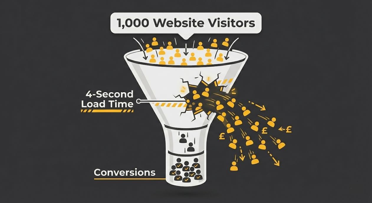
If your site isn't meeting the 3-second load time threshold, then you're not just losing impressions, you're losing opportunities. Consider an Edinburgh consultant who lands a high-value lead. That lead clicks on the "Contact" page, but it takes 4 seconds to load. In those 4 seconds, they get a notification, get distracted, and leave. One extra second of lag just cost that consultant a potential client.
Amazon found that every 100ms of latency costs them 1% in sales. For smaller businesses, the percentages are likely higher because you have fewer visitors to begin with.
Conversion Rate Optimisation (CRO) is the process of finding and fixing these leaks. Better UX can significantly improve your conversion rates. The first step is measuring what's actually happening on your site.
Clarity Wins Attention
Visiting a website is more like scanning a sign than reading a brochure. Users decide almost instantly whether it's relevant to them. A fast site with clear, direct messaging gives them confidence to stay. Anything vague, slow, or overly clever creates doubt — and doubt is enough to lose them.
If you'd like to know where your site stands, get in touch and I'll take a look.