
Introduction to UI: Why Great Interfaces Matter More Than Ever
Published on 18 June 2024 • 6 min read
When you first land on a website or open a new mobile app, your brain makes a judgment in the blink of an eye—we're talking about 50 milliseconds, according to research from Google. That is a tiny window of time for you to make a positive first impression. This is the world of UI design, and it's about far more than just making things look pretty.
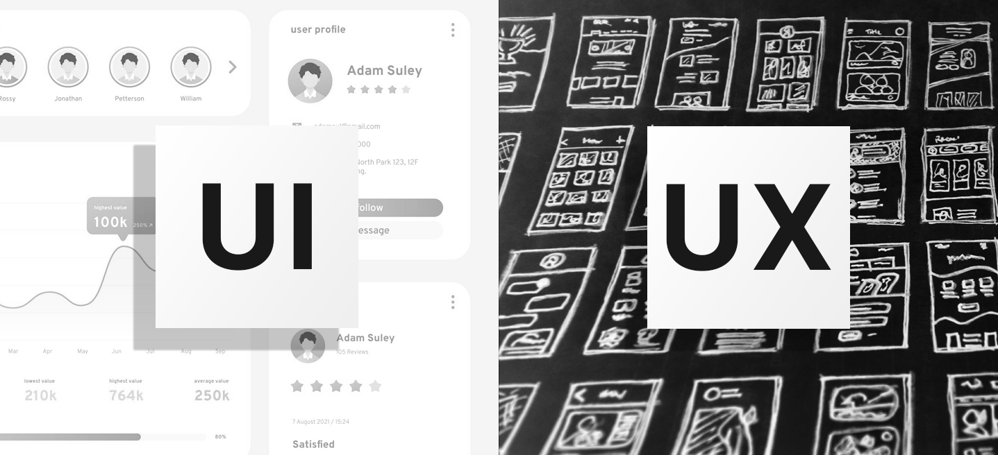
User Interface design is the process of creating all the visual and interactive elements a person engages with when using a digital product. It covers everything from the buttons you click, the menus you navigate, the colours you see, and the overall layout of the screen. Our goal, as designers, is to develop interfaces that are not only beautiful but are fundamentally easy and effective to use.
Beyond Aesthetics: The Critical Business Impact of Good UI
A well-designed user interface isn't just a nice-to-have; it's a powerful driver of business results. Whilst the primary focus is always on the end-user, the financial returns of investing in thoughtful UI design are staggering. A 2023 Forrester study, for instance, found that companies that seriously commit to improving their UI can see returns on investment up to 9,900%.
Why such a huge return? Because design directly affects user behaviour and trust:
- Retention is Key: A painful or confusing interface drives people away. Research shows that 88% of users are less likely to return to a site or app after just one bad experience.
- Speed is Money: Even a tiny 100-millisecond delay in page load time could result in a measurable loss in sales. Users expect speed, and UI must be streamlined to support quick performance.
- Trust and Credibility: Good design is synonymous with professionalism and quality. When an interface looks considered and professional, brand credibility can increase by 75%. In the competitive digital landscape of Web Design Edinburgh and beyond, this credibility is essential.
Deconstructing the Elements of Great UI Design
What exactly goes into building an intuitive interface? It's a combination of several interlocking components that work together to guide the user naturally.
1. Layout and Navigation
The way you structure information fundamentally dictates how effectively a user can complete tasks. We know that users don't read every word; they scan in patterns, like the F-pattern (common on text-heavy pages) or the Z-pattern (for more visually balanced pages). Consistent navigation is vital, with studies showing it can improve task completion rates by nearly 40%.
2. Colours and Typography
These are the visual tools we use to establish brand tone and hierarchy. Colour choice is crucial: it can increase brand recognition by 80%, but it needs to be used sparingly—most top brands use only two or three primary colours. Similarly, typography isn't just about picking a nice font; it affects readability, with poor choices potentially slowing down reading speed by over 10%.
This is where a design system comes into play. For example, when working with a client like Thistle Mediation, the first step after wireframing was to formalise these choices. We didn't just pick colours at random; the brand already had a purple-and-green palette, and we built a small design system around it. We paired it with a clean, friendly font and established the exact spacing, button styles, and hover states. This foundational work ensures that every element, from the largest heading to the smallest icon, looks and behaves consistently across the entire site.
You can read more about how these choices were established in my case study on Thistle Mediation Project.
3. Feedback and Interaction
A user needs to know their action has been received. This feedback loop is essential, whether it's a button changing colour when pressed, a loading bar appearing instantly, or a confirmation message showing up. Micro-interactions—small animations or reactions—are subtle but powerful tools that can increase engagement by over a third. We always aim for interface responses to be within 100 milliseconds to feel instantaneous.
Best Practices: Designing with Intention
Moving from components to best practices means ensuring the design serves the user's needs efficiently and delightfully.
Prioritising Visual Hierarchy
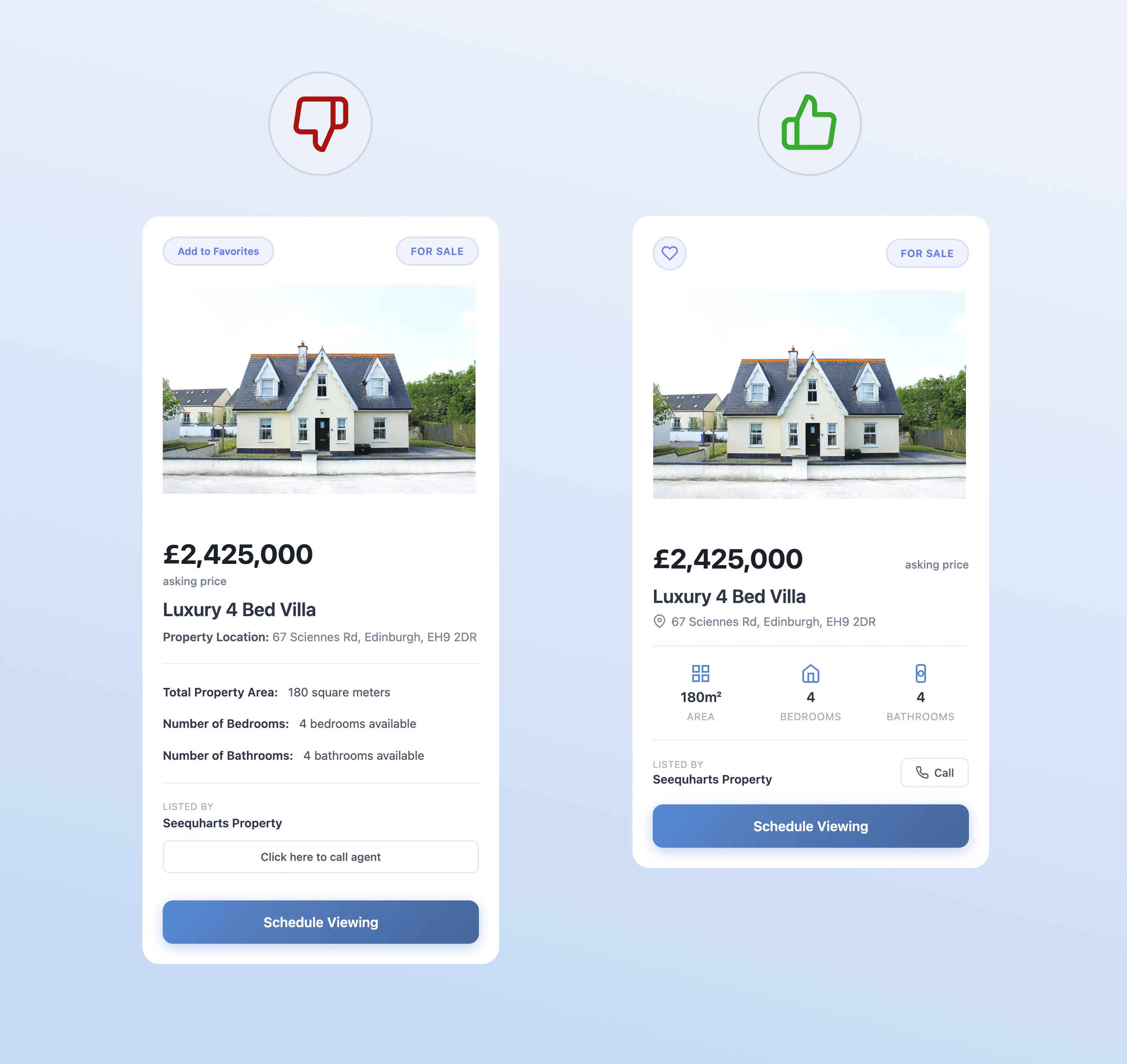
Visual hierarchy is the art of directing the user's eye. It dictates which elements are most important (a Call to Action button) and which are less important (a standard footer link). A clear hierarchy can increase content findability by nearly 50%. A major part of this is using white space effectively, which, counterintuitively, improves comprehension by 20% by reducing cognitive load.
Our process for projects, like the work for Vantage CFO, always starts with iterative refinement on high-definition mockups. We begin with the most crucial areas—the hero section, headings, imagery, and calls to action—to find the right balance from both a UX and UI perspective. We then refine the layouts and positioning of icons and the photos section by section. This process ensures we are not just making a pretty picture, but we are designing a clear, structured flow that supports the business objective.
See how the iterative process led to a clear, professional interface in the Vantage CFO Case Study.
The Importance of Performance and Accessibility
We've mentioned speed, but it bears repeating: animations that feel natural need to be under 400ms. If transitions are smooth and fast, user satisfaction increases significantly.
Equally important is accessibility. This isn't just about being compliant; it's about good design for everyone. Ensuring that the contrast ratio for text is high enough (at least 4.5:1) and that interactive elements are sized appropriately to ensure comfortable and reliable tapping (a minimum of 44x44 pixels on mobile) dramatically reduces error rates and improves the experience for all users.
Current Trends Shaping the Future
UI design isn't static; it constantly adapts to new technology and user expectations. A few key trends are currently setting the pace:
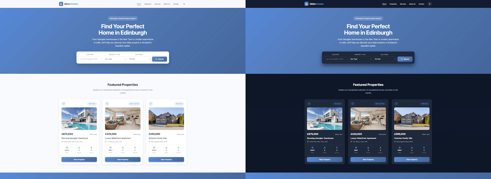
- The Rise of Dark Mode: Adopted by over 80% of mobile apps, dark mode isn't just a gimmick; it reduces eye strain and conserves battery life, making it a powerful UI feature.
- Accessibility-First: What started as a niche requirement is quickly becoming a design standard and, in many places, a legal necessity. Designing for screen readers and high contrast is now non-negotiable.
- Voice and Gesture: We are seeing a 73% increase in gesture-based interfaces (like swiping and pinching) and a 48% growth in voice user interfaces. These trends mean designers must think beyond the mouse and keyboard to include new methods of interaction.
The future of UI will likely be shaped by even more emerging tech like augmented reality (AR) and artificial intelligence (AI), requiring designers to continually learn and adapt how we approach the digital canvas.
Ultimately, whether you're looking for high-quality Web Design Edinburgh services or building an app for a global audience, the user interface remains the most visible and visceral connection point between a product and its user. Investing in it means investing directly in retention, sales, and brand credibility.