Dee Murray Therapies
New Website For New Start Up
- Dee Murray Therapies
- Web Design + Code
- Wordpress
- deemurraytherapies.co.uk
The Client
Back in 2015 one of my first clients came to me with a request for a new website for her new business venture in alternative therapies. Dee Murray specialises in therapies such as Shiatsu massage and EFT (Emotional Freedom Technique). She needed new branding and a website for her new startup business.
The branding and website would need to help Dee connect to her clients in a different way. My design brief was a logo which would give the impression of positive energy and a positive flow of energy release. From a design point of view the website was required to be minimal whilst not appearing sharp or alienating. The website also needed to play a key role in helping Dee connect with her clients via a blog as well as helping her gain potential clients via a mail list gathering strategy.
The Logo
I consider the logo a key part of the brand and therefore I decided that it had to come first; followed by the colour scheme of the website. Any other further branding would come from the logo and colour scheme. The client wanted the logo to very much reflect the form of therapies that she practices and to move away from something that could be considered more conventional such as the Buddha, lotus leaves, a hand with meridian points on it and so on.
I undertook research in to the two therapies, EFT and Shiatsu, and then began to put some ideas down on paper, initially in rough sketch form which developed into taking two ideas a step further into a mock stage using design software. In the end I gave Dee two ideas to choose from both can be seen below. The logo on the left which leans more to convention and to the right which plays more to the client's brief with an image of positive energy flow.
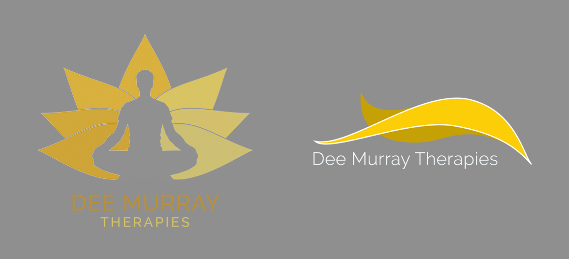
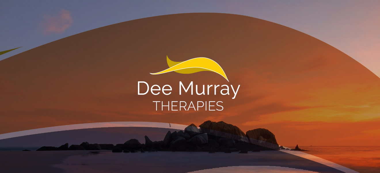
The energy idea (above right) was the final choice, it was then taken and tuned up a bit up with a key line stroke that gives it a bit more pop and then the next stage was to add the text. For this I chose Google's sans serif font Raleway as I wanted something modern with a nice big bowl (link to what a bowl is in typography) as I think big curves in type give off a nice relaxed feel.
Website Design & Code
After looking at the competition in this market and gathering Dee's thoughts on what she wanted from the website I felt very confident that together we could make something that would resinate positively within Dee's existing clients base and would help to convert an increased number of potential clients visiting the new website.
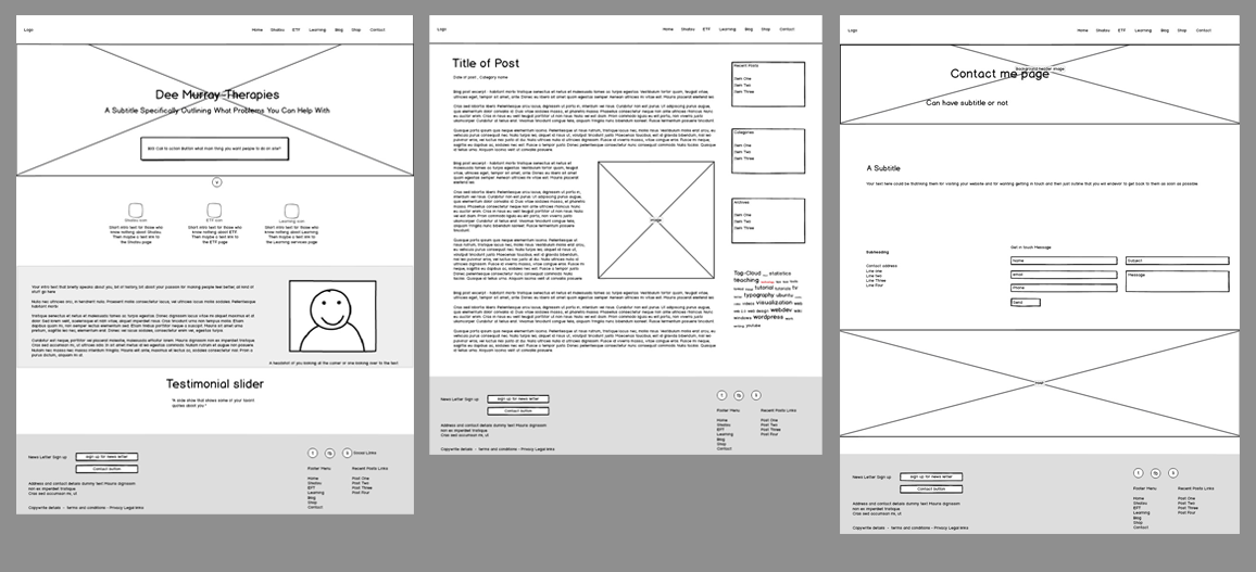
To start with I used wireframes to show what the layout of key pages would be and what the users path throughout the suite would be.
Using the same colour scheme as the logo and various hues of grey as a starting point I first decided not to have a pure white background as in some cases the contrast can dazzle the eyes. However, on mobile screens I wanted there to be more contrast to give the site a bit more pop on smaller screens so it falls back to a lighter grey/off white. To help create some contrasting text styles between the headings and the body text I added the second font from Google called Merriweather. The font has a classy old style and shares some similar traits to Raleway such as x-height.
After choosing colours and fonts and discussing these with the Dee I went on to the design different sections of the site starting with the home page header. As this section is the first part of the website most viewers will see I thought it would best to get over the right feeling/ambiance of relaxation. I decided that an image slider would be a bit too distracting and that the user needed to be engaged with a clear message and then a call to action.
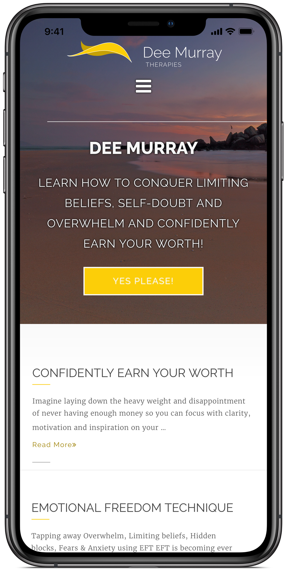
The process continued in this way for each element of the website. I demonstrated to the client what the section would look like on mobile devices and then on desktop. Using this method the client doesn't get a full mock up of what the website looks like in Photoshop because Photoshop is not responsive and doesn't show the differences between the IE9 browser and the Chrome browser on the Mac. I believe in showing what different key sections of the website look like first, getting those signed off and then building those sections in code and showing the client the site as these key sections are built in a development area. That way they get to see the key sections fitting together and the overall build doesn't come as a shock at the end.
The Final Result
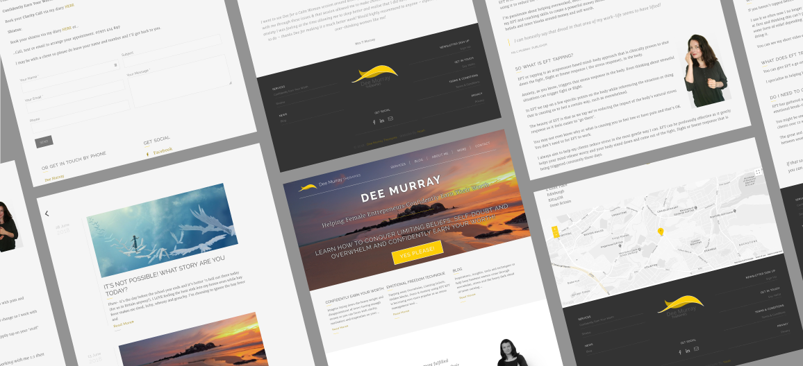
A website that is fully responsive across multiple screen sizes and looks clean and fits the ethos of the brand.
Client Testimonial
I hired Noah for my previous two websites and he was the obvious choice for my new venture.
As I am starting a new business I wanted a completely different look and feel. I also wanted a new logo.
I gave Noah some ideas on my theme and the feeling I was hoping to convey and he came back to me with some great ideas. The process was broken down into bite sized pieces for me and he set me up with a Dropbox folder and the Trello organisation app so we could collaborate with ease.
We also had plenty of face to face meetings where I could see the logo and site thus far and give my approval or ask him to make changes before it was set in stone. I definitely had a very specific set of needs and Noah was great at bringing them to life for me.
He also taught me how to add my own content and blog so that I can do a good portion of the website upkeep myself.
I must say I love my new website. I wanted a simple, easy to use website, that allows me to blog, have a blogletter and sell products, all while conveying a sense of relaxation and calm to my clients. I’m very happy! Thanks Noah!
Dee Murray - Owner of Dee Murray Therapies