
Thistle Mediation
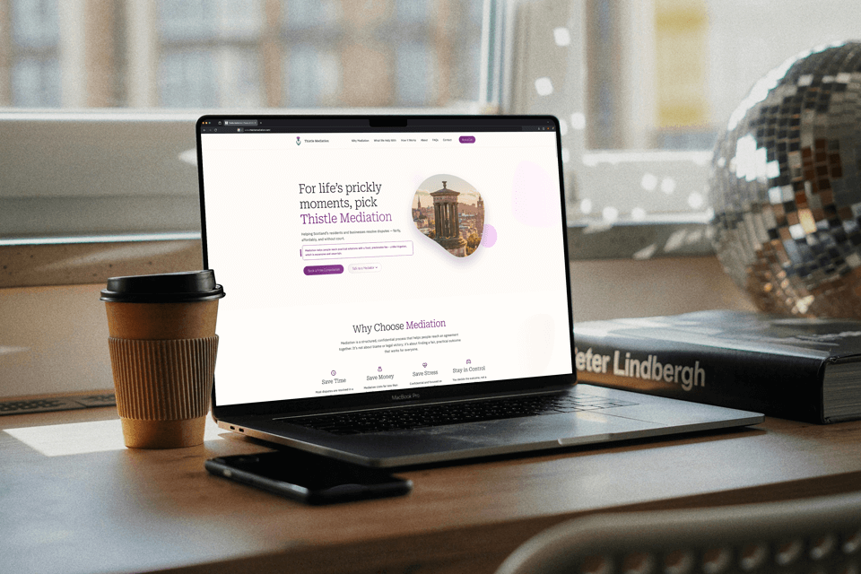
A calm, professional website for an Edinburgh mediator
- ClientDoug Richards
- BriefWeb Design + Code
- TechnologyWordPress, Figma, GSAP
- Websitethistlemediation.com
The Client
I've worked with Doug before on a previous website project, so it was great to hear from him again when he launched his mediation practice. He's an Accredited Civil & Commercial Mediator based in Edinburgh, and he needed a professional online presence that clearly explained what he does while helping potential clients feel confident about getting in touch.
The Brief
Doug wanted a one-page WordPress website that was simple, calm, and easy to navigate. He had six main service areas to present, along with a process section, FAQs, contact details, and some downloadable documents.
He also wanted strong SEO foundations and a structure that supported conversion. Doug writes very well, so he supplied the core content, and we refined and reorganised it together so the messaging felt clear and guided visitors naturally through the page.
Planning
Once I received the brief, I mapped out the sections of the homepage and walked Doug through a plan for the flow of the content. We talked through how people approach mediation, what they want to know first, and the best way to guide them from understanding the service to feeling ready to reach out.
I introduced a simple Conversion Rate Optimization (CRO) framework to help shape the order of the page:
What it is → Why it helps → How it works → Who's behind it → How to get in touch
This sequence made the message more direct, and it helped us decide to move his "Why Choose Mediation" content near the top so visitors immediately understood the benefits before diving into details.
After a few iterations, the hero text was tightened up to communicate the value of mediation in a calm and approachable tone.
Wireframing
With the structure agreed, I produced a wireframe showing each section and how the content would sit visually.
The planned layout included:
- A simple, calming hero section
- Why Choose Mediation
- Six service areas
- The mediation process (Before / During / After)
- Meet Your Mediator
- FAQs
- Contact details and CTA
- A small downloads section for key documents
One area I flagged early was the Process section. It contained important content but risked reading like an extra-large block of text. I made a note to explore ways to make this more engaging.
Design Foundations
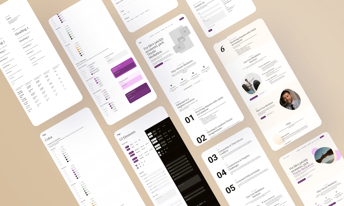
Once the wireframe was approved, I moved to Figma and built a small design system. Doug's brand already had a purple and green palette, so I used that as the foundation and paired it with typography that felt clean and friendly.
The design foundations also covered spacing, button styles, hover states, icon style, and simple organic shapes that added a softer visual feel to the layout.
Solving the Process Section Problem
The process section needed to explain five steps clearly, but I wanted it to feel active rather than heavy. My solution was to introduce an animation-based sticky number section.
As the user scrolls through the process, a large number stays fixed on the left side of the screen and updates from 1 to 2 to 5 as the related content enters view. It keeps the reader focused, breaks up the text, and adds a bit of visual interest without distracting from the content.
High-Definition Mockups
With the foundations in place, I worked through each section in Figma, starting with the header, hero, and footer. From there, I built each block of content, pairing Doug's writing with images and icons that kept the page feeling light.
We iterated section by section until everything felt coherent and visually balanced.
Development
With the designs approved, I built the site on a private WordPress staging area.
I started with global styles and buttons, followed by the header and footer. Icons were imported as SVGs (scalable graphics), imagery was optimised, and GSAP animation was integrated to match the behaviour planned in the mockups.
Key development parts included:
- GSAP sticky number animation for the process section
- FAQ accordion
- SVG icons for clarity on all devices
- Optimised imagery
- Contact form setup
- Phone link and CTA buttons
- Document downloads
- SEO configuration with metadata and keywords
Finishing Touches
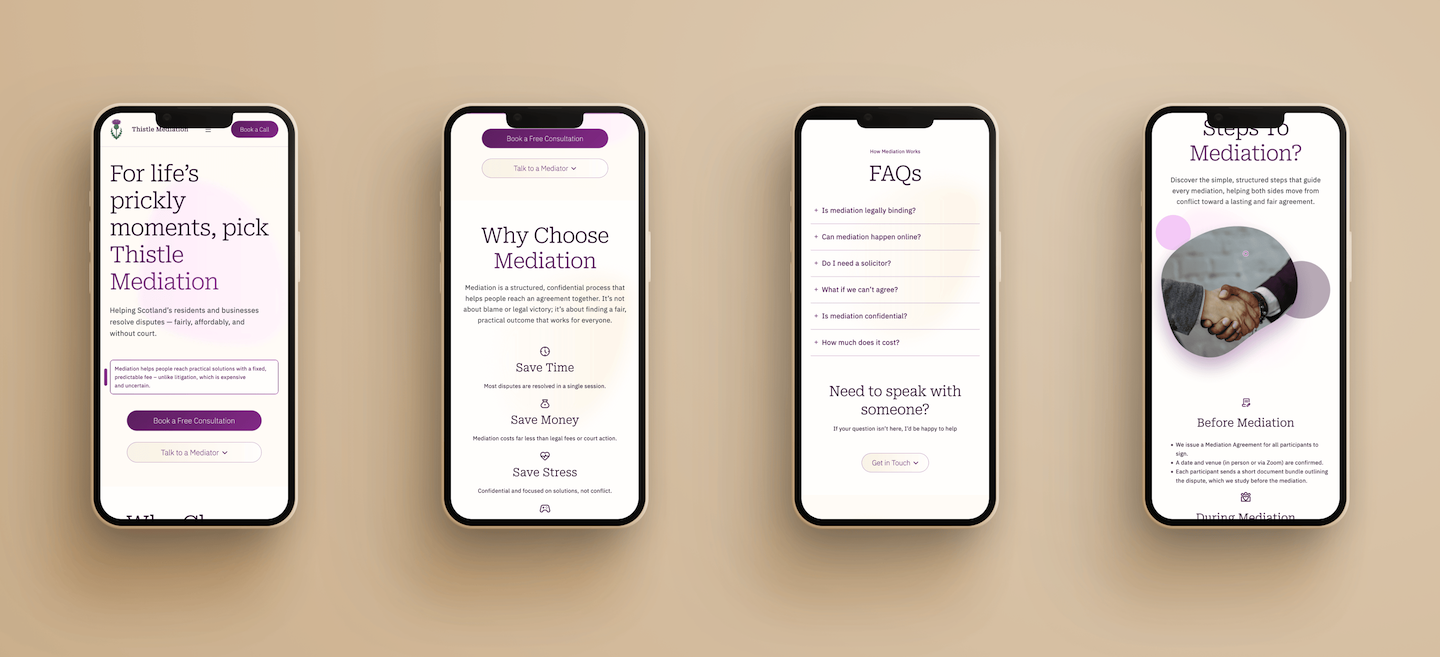
I tested the site on different devices, checked load speeds, and reviewed its accessibility and responsiveness in Chrome Lighthouse, where it scored 27/29 for Accessibility, which is an excellent result.
The Final Result
Doug now has a clear, calm one-page website that communicates his services and makes it easy for people to understand mediation and reach out.
Within the first eight days of going live, Doug started to receive enquiries through the site, which is a strong indicator that the structure and messaging are doing their job.
Need help with your website design and development? Looking to create a professional online presence for your business? Then get in touch and we can discuss your project requirements.