
Video Production Edinburgh
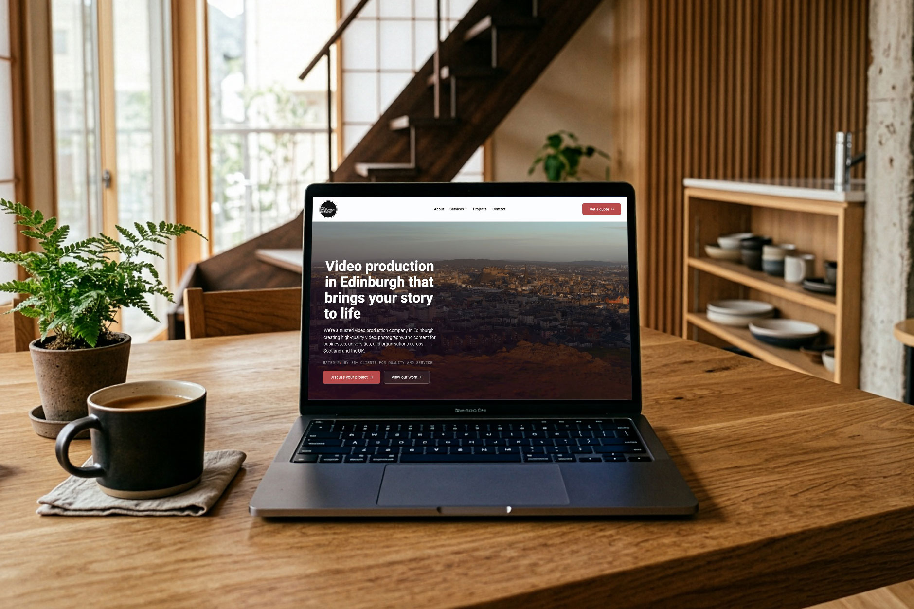
A full website rebuild for an Edinburgh video production company
- ClientPaolo Drusi - Video Production Edinburgh
- BriefWeb Design + Code + SEO
- TechnologyWordPress, Figma, Vimeo
- Websitevideoproductionedinburgh.co.uk
The Client
Paolo runs Video Production Edinburgh, a video and photography production company that has worked with universities, schools and public sector clients across Scotland for over 15 years. He came to me needing a full rebuild of the company's website.
The Brief
Before the project started, VPE had brought in a marketing consultant to run some research with his own long-standing clients. It rated things like ease of working with the team, flexibility and final quality between 4.8 and 5.0 out of 5. The website itself scored lower, and one client put it plainly: it felt a bit dated compared to other video companies.
That set the brief: a site that matched the quality of the work behind it, without losing the personal, not-corporate feel that kept coming up in what clients said about working with the team.
Planning
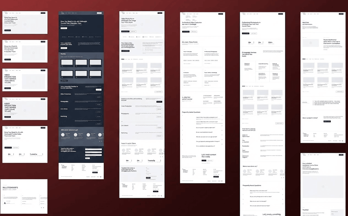
From our initial meeting I started drawing up a plan for the site, beginning with rough sketches before moving into proper wireframes. We mapped out the structure together: Home, Portfolio, which Paolo referred to throughout as Case Studies, Services split by discipline (Video Production, Photography, Livestream, Marketing), About and Contact.
The Portfolio page needed the most thought, since it was going to be one of the key pages on the site, and we spent time talking through how it should be filtered. The obvious option was to filter by service, but we came to the conclusion that most people landing on the page already know what service they need. What they are really looking for is proof VPE can do the job for someone like them, so filtering by industry made more sense.
That mattered even more given VPE's plans to branch out beyond education into other client types. Industry-based filtering gives each new sector its own way in later on, rather than everything getting lumped under one service.
No colours or typography were decided at this stage, just how each page should be structured and what needed to sit where.
Design Foundations
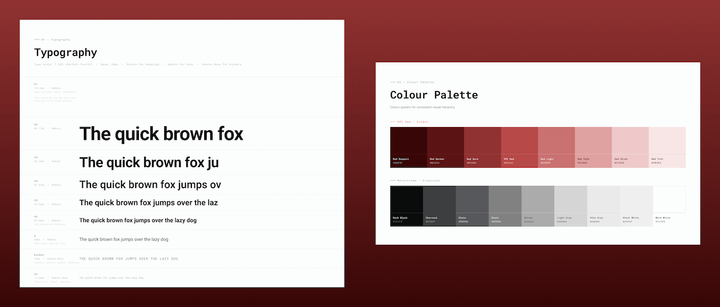
With the wireframes approved, I moved into Figma to build a proper style guide before touching any page designs: logo usage, colours, typography, buttons and iconography, all defined in one place so the site would stay consistent as it grew.
The initial direction was a fully monochromatic site, in keeping with the VPE logo and brand. I kept that as the base, but brought back the red used on their previous site as a highlight colour rather than dropping it altogether. The research had picked up on words like friendly and personal coming up again and again from VPE's own clients, and a purely black-and-white site risked losing that warmth. The red gave the site a way to stay sharp and professional while still feeling approachable, and it tied back to something clients already associated with the brand.
For typography, Roboto was the starting point, and I used it across a few weights to give enough contrast between headings and body text without introducing a second typeface. Spacing follows a 4px grid, which kept things aligned and consistent as I moved between sections. Buttons carry an 8px corner radius, with one outline button style used on the homepage, and icons follow a simple, consistent line style throughout.
High-Definition Mockups
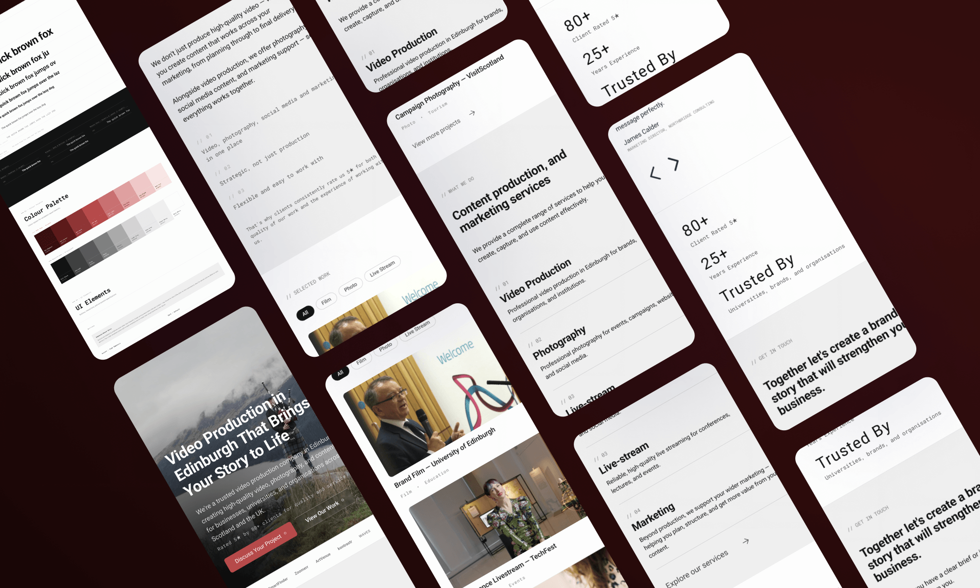
With the foundations set, I moved through each page in Figma, thinking about layout in terms of return on conversion rather than just how a page looked. Each section was there to answer a question the visitor would naturally have next, so they would keep moving down the page rather than stopping and leaving.
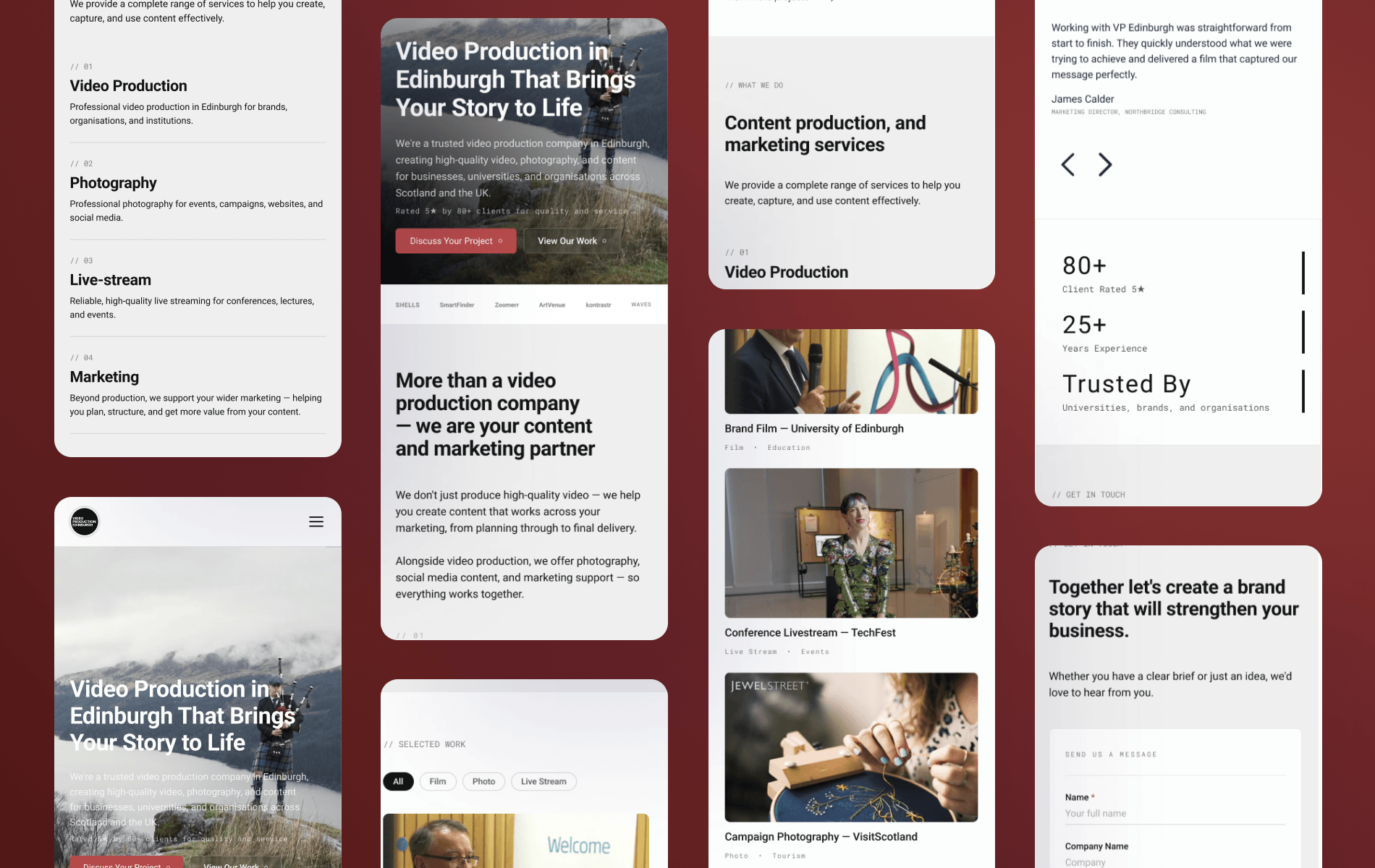
The homepage sets that pattern out clearly. It opens with a full-width hero video and a headline, backed straight away by a client-rated statistic and two calls to action, one for people ready to enquire and one for people who want to see the work first. Client logos follow directly underneath to build trust, before a short section reframes VPE as more than a production company, positioning them as a content and marketing partner.
From there the page moves into a filtered selection of recent projects, then services, then testimonials and stats, and finishes with a low-friction enquiry form. Nothing on the page is decorative. Every section is there to move the visitor to the next one, and the work itself, rather than heavy blocks of copy, is doing most of the persuading.
Other main pages carry an H1 heading and the same trust strip, so that credibility signal is repeated across the site rather than only on the homepage. The brief was clear that the trust strip shouldn't appear on subpages or blog posts, since repeating it everywhere would start to feel like the site was trying too hard to convince people.
I worked through each page section by section, with rounds of client feedback before moving to development.
Development
I built the site on WordPress with a custom theme, rather than relying on an off-the-shelf template. Projects are organised using custom taxonomies for industry and service, so the VPE team can filter and sort the portfolio without needing a developer involved. The site launched with 18 projects live, with the structure in place for VPE to keep adding to that over time.
Video is handled through Vimeo, including a project archive of unlisted embeds, which took some care to set up correctly. Forms are built with Forminator, with enquiries routed so replies go straight back to the person who got in touch.
SEO was built in from the start rather than added on afterwards: a proper heading structure from H1 through H5, alt tags on every image, and a site structure designed to be easy for search engines to read.
Finishing Touches
I tested the site across devices and browsers, checked responsiveness, and reviewed accessibility before launch. Once the site went live I kept a short bug fix window open to catch and resolve any technical issues, separate from the design work that had already been signed off.
Client Testimonial
I'm the director of Video Production Edinburgh, and I worked closely with Noah on the redesign of our company's website.
Having a background in web design myself, I knew what I was looking for, and Noah exceeded my expectations in terms of the care and approach I had hoped to find.
From my first meeting with Noah, I was impressed by his extensive knowledge and thorough, structured approach. I felt supported throughout the process, and he patiently suggested improvements and more effective ways to achieve the results I was seeking. Noah didn't just provide web design services; he also helped curate the content and guided me in making the right decisions from both design and marketing perspectives.
This allowed me to create the website I had hoped for, and we are all very impressed with its overall quality and Noah's attention to detail. We have received excellent feedback on the new website from colleagues and clients, and our conversion rate has already improved.
Strongly recommended if you are looking for the right web designer.
Paolo Drusi - Managing Director, Video Production Edinburgh
The Final Result
VPE now has a website that reflects the standard of work the team has been producing for 15 years, built around their existing brand rather than a generic template. The portfolio structure is built to grow, so as VPE adds more projects over time the site will keep pace without needing another development phase.
Paolo has since reported that feedback from colleagues and clients has been good and that their conversion rate has already improved, which is the outcome the structure and the page order were designed for.
Need help with your website design and development? Looking to create a professional online presence for your business? Then get in touch and we can discuss your project requirements.